
Overview
User inverviews
Progressive disclosure
Product pages
Cart
What I’ve learned
Choosing ingredients
User account
Desktop prototype
Mobile prototype
Visual design and clickable prototypes
Home pages
Personas
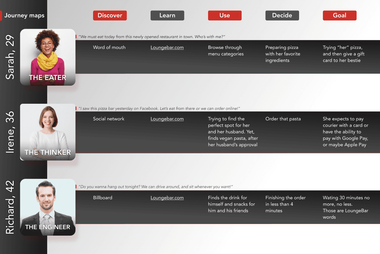
User journeys
Information architecture
Competitive analysis/concurrents investigation
LoungeBAR from Ohio, Texas
LoungeBAR is an online restaurant that is a newcomer to the market. They want to be competitive and that is why they believe that investing in an innovative and simple website is crucial for them in conquering the American market. Of course, a mobile app would be in development.
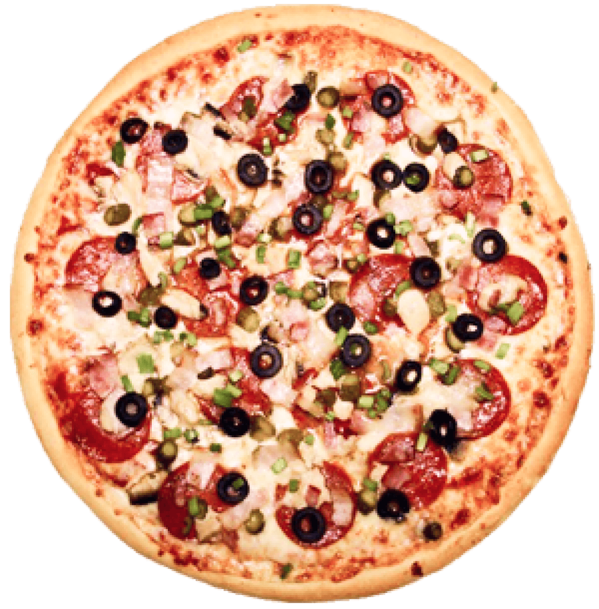
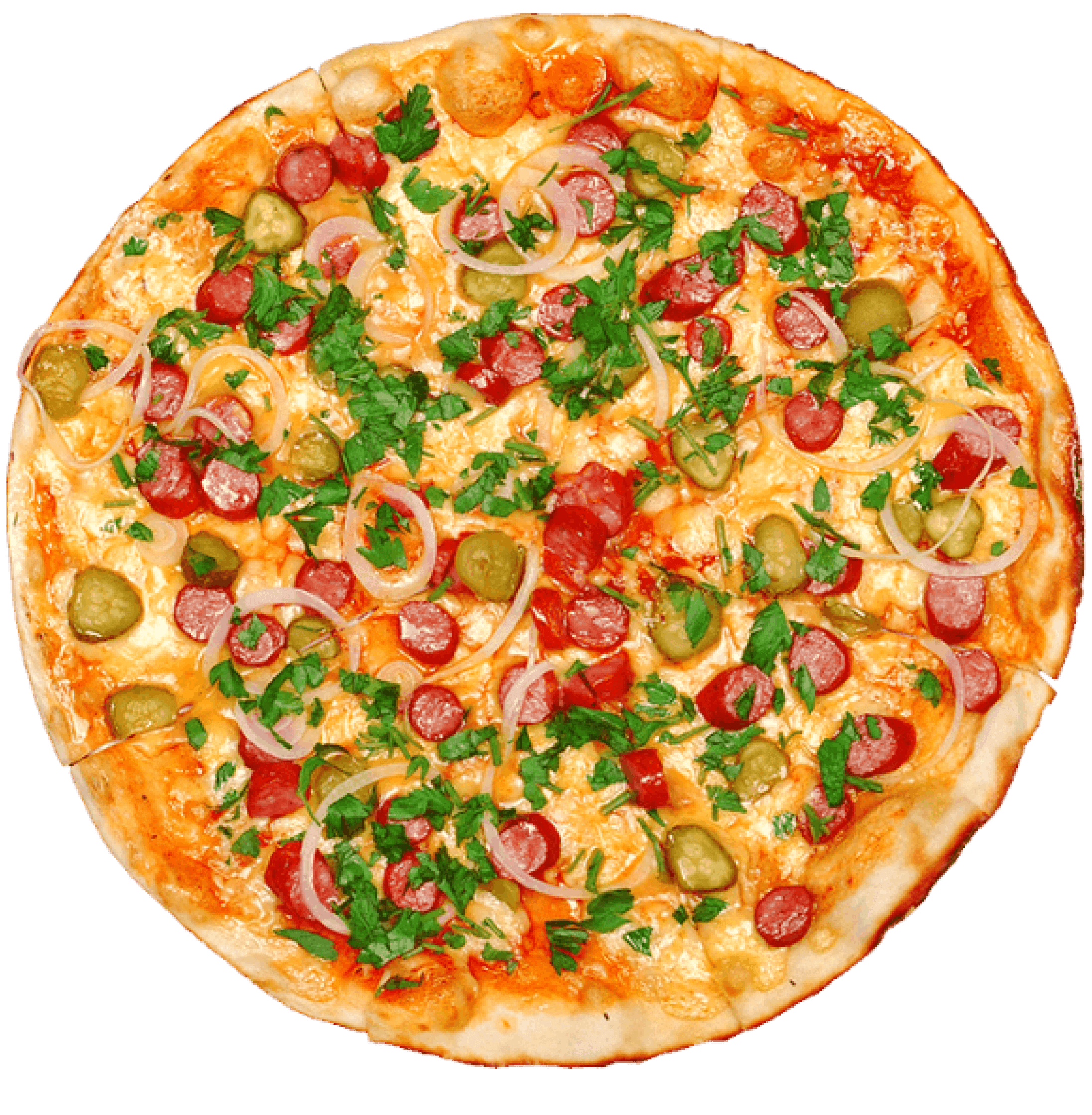
They will offer appetizers, pizzas, pasta, and desserts. According to them, what sets them apart from the competitors is the delivery time of 30 minutes and the possibility for their users to garnishing, i.e "cooking" the pizza.
Single people and busy business people who do not have much time to cook on their own are actually their biggest target, and the age range is assumed to be 25 to 40 years old.
Because of previous analysis, I had an idea of what questions to ask potential customers of LoungeBAR.
Within 4 hours I had a response of 12 users, quite enough to create three personas, who will actually pave the way to their user journey.
It is worth noting that most people do not care if the food arrives in exactly 30 minutes, they just want it to be tasty and hot, and the creation of the pizza itself does not play a very big role for themselves. Yes, it's nice to have it as an option, but these users were not very excited.
Many of them would subscribe to Newsletter to get discounts, and many also praised the loyalty system
and Gift cards.
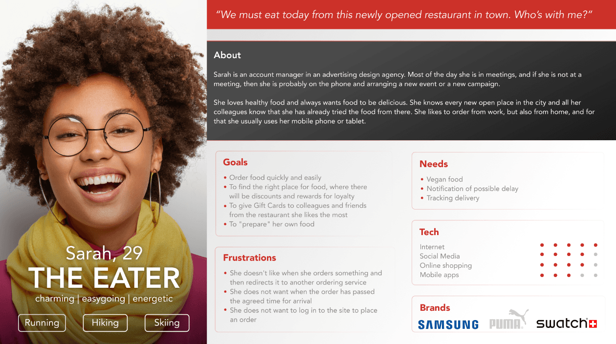
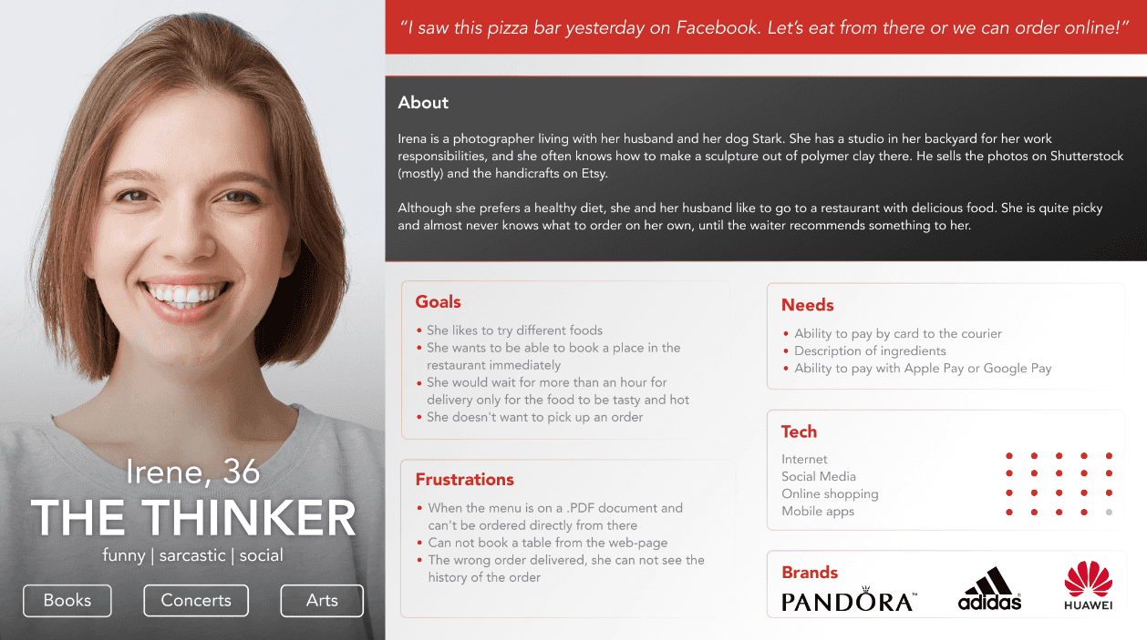
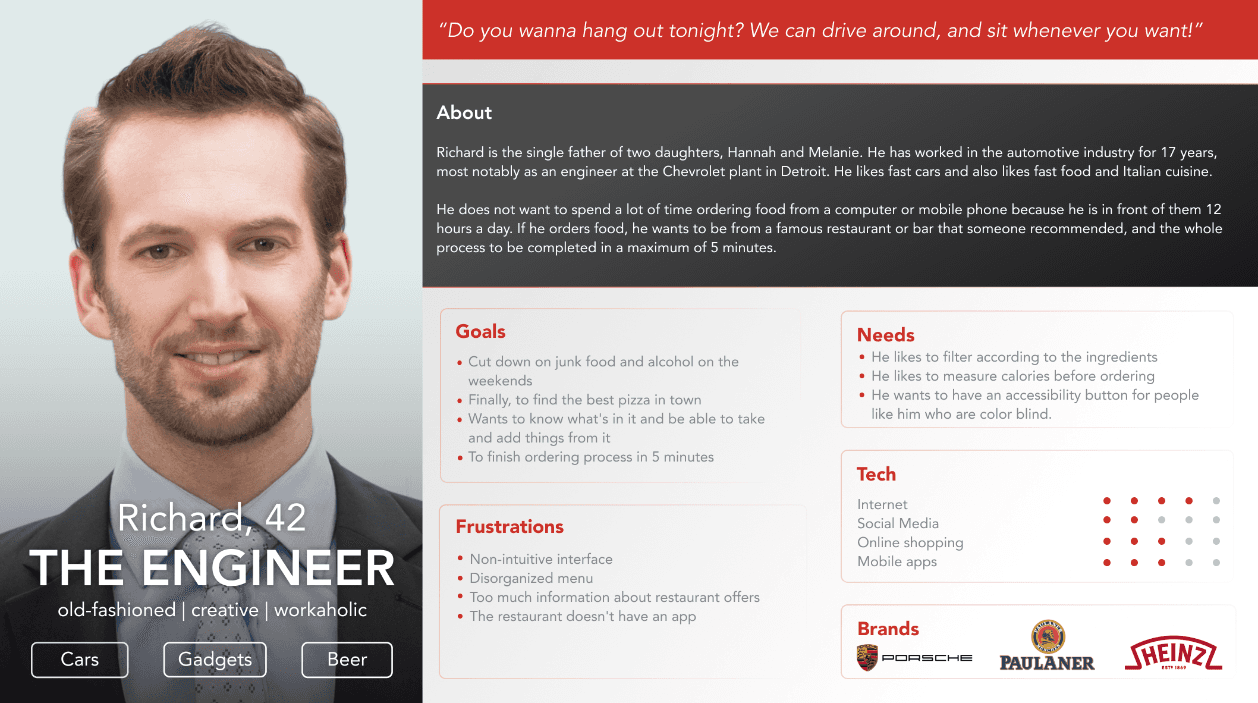
Using the quantitative and qualitative data from interviews and survey results, I defined the three target group profiles Sarah, 29 (Account manager), Irene, 36 (Photographer), and RIchard, 42 (Engineer) to better empathize with my main user groups and prioritize goals according to their needs.
I tried to humanize Sarah, Irene, and Richard and give them real human qualities. I almost had the flows in my head, but, there was only one more thing to do before I got into designing the LoungeBAR website.
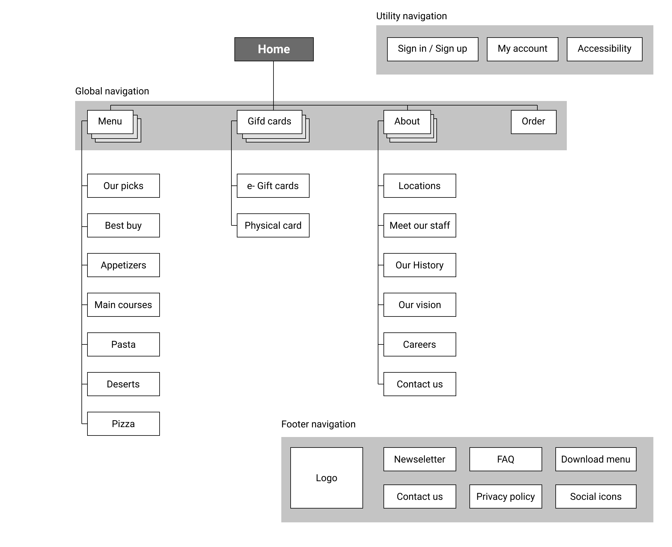
After all this research and the creation of visual stories for the users is done, the next thing to do is creating information architecture.
Now we have the "skeleton" on the site, and now I can easily focus on my design plans.
But before I jump in with any design, I asked myself the question of the Progressive Disclosure and Decision Path of the users. What do our users want to see first, what will they do next, what is it that will give them the assurance that LoungeBAR is their next partner for stomach enjoying and how that assurance and value would bring the owners new customers, retaining existing ones, and certainly greater financial security, for of course more new locations across the US?
Any information that confuses our user or any information that the user absorbs and is not yet ready for it, we call noise.
UX value loop supported by Progressive Disclosure should give one of the best user experiences.
Let’s dive in!
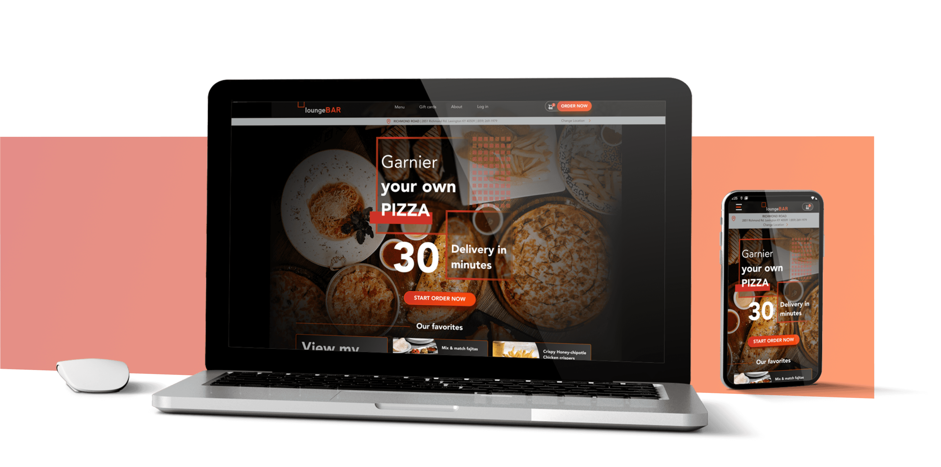
Introducing the mobile and desktop versions of the LoungeBAR website.
Perhaps one of the major challenges was to create a simple and clear interface, which new users would immediately like.
I opted for dark mode on the whole interface because it looks more elegant, and the generation for which it is intended, actually knows that the dark variant is trendy, and of course, it suits the eyes better.
Below are the screens, from the home page of both versions where users start to find out about this new online restaurant and already starting to have interactions with this website.
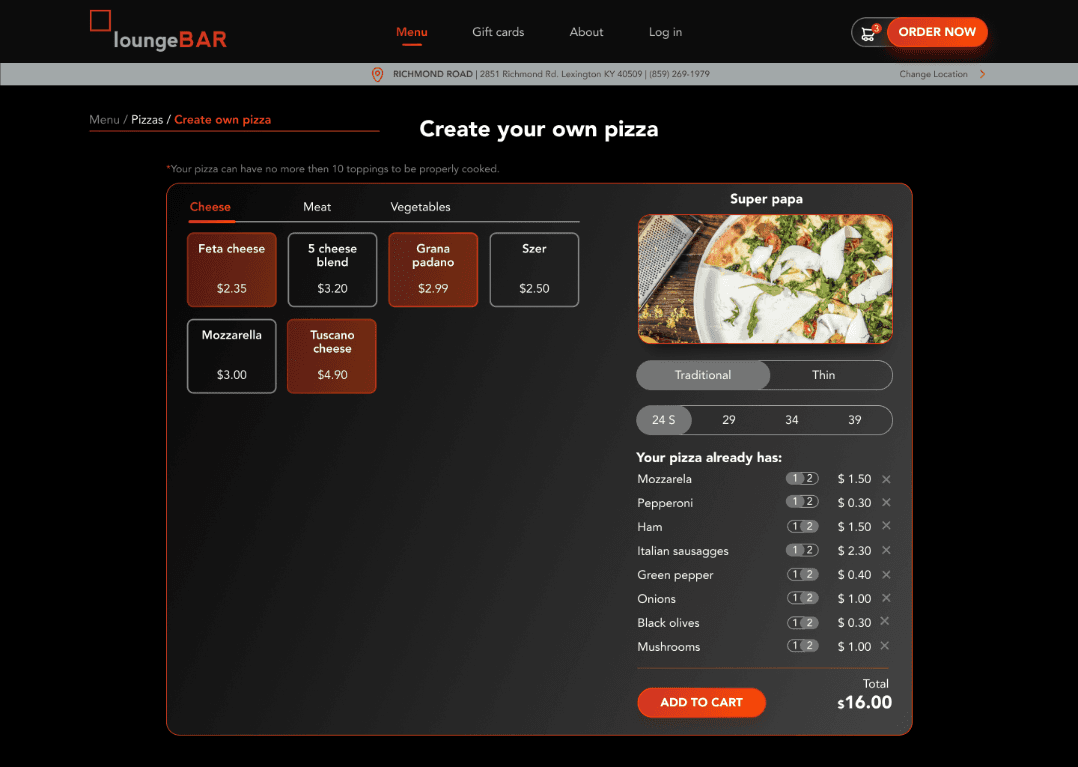
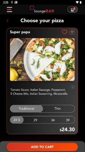
However, the main reason for someone to visit this site is the products, i.e the food.
So, the users can choose to filter meals, in our case, the pizzas, to choose new ingredients with which to "cook" the pizza, to check the nutritional values, to make it a favorite and of course, to put it in their cart.
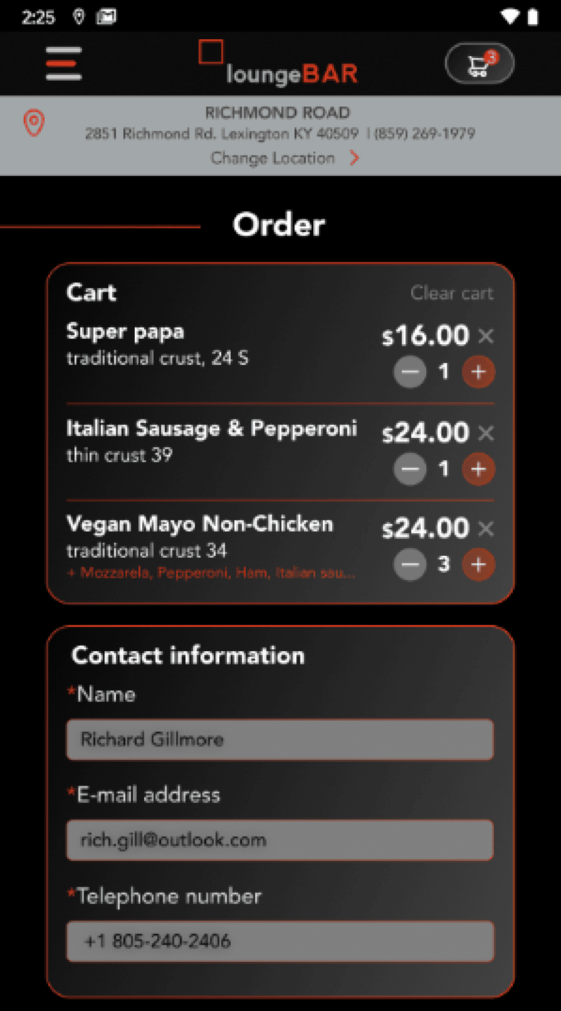
I will not describe the cart too much, given that this screen is intended for the user before paying and of course to enter his personal order information.
What I have learned while doing this project is that user interviews MUST be done by every user experiencе designer, the personas have become my best friend, and the user journey is what makes any user experience seamless and fluid.
I solved the addition of pizza ingredients by navigating the tabs, so the user can choose between cheese, meat, and vegetables.
For the mobile version, I split the whole process into multiple screens for better visibility, and the user already knows the habits with the bottom navigation bar.
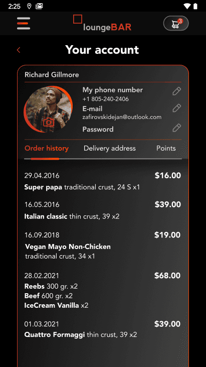
User account screens are similar to the component display, table view. The user is already familiar with the interface, so this navigation will not be unfamiliar to him.
Here, the user will be able to pick between the history of his orders, address for delivery, and his rewarding points or maybe gift cards.
Here you can view the desktop clickable prototype.
And here is the mobile version of Figma prototype.
The situation is similar to the mobile version, with the focus on the index finger and its easy interaction with the lower part of the interface.


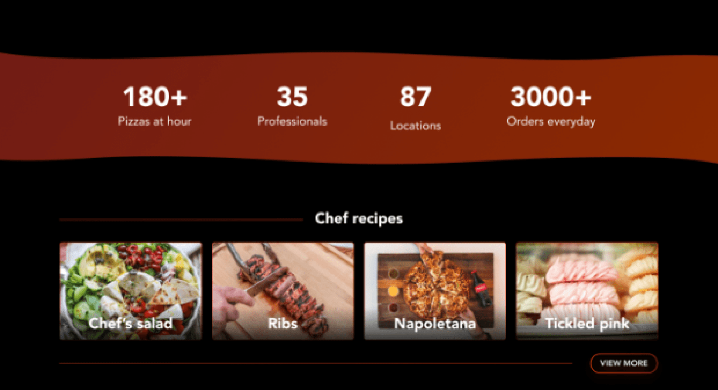
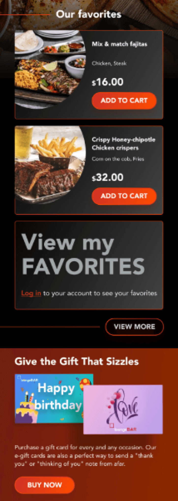
Our favorites are actually the best or best-selling products of the restaurant and they are approved by the head of the restaurant.
View my favorites means that the user can save his favorite meals, and to access them, he'll need to create a user account.
This section lets users know that they can buy gift cards for themselves or their friends.
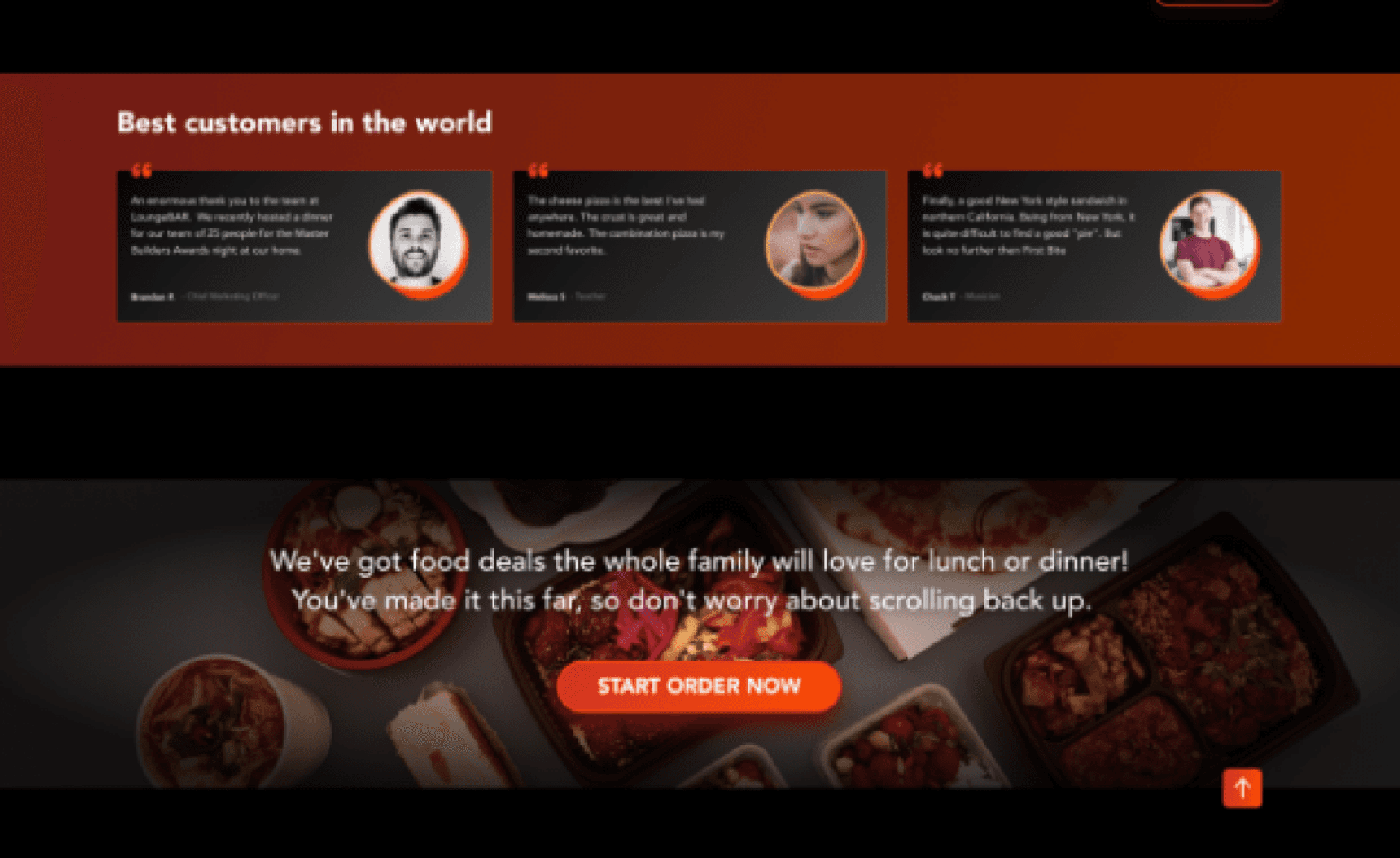
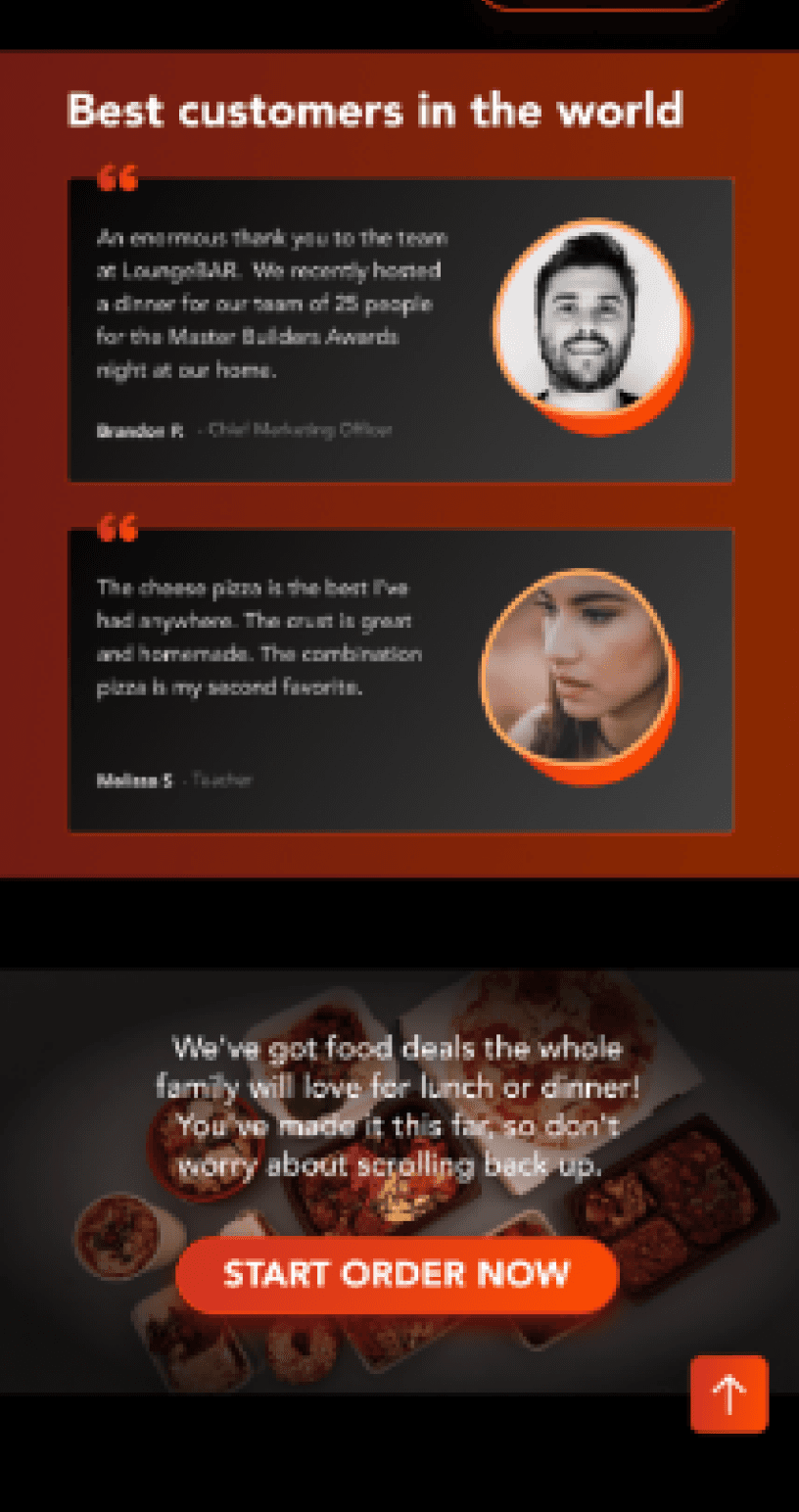
Here, it becomes clear to the users that this restaurant has something to show and prove to them,
and users' testimonials are here to just confirm that.
Since this site/application is new on the market their competitors needed to be explored. There is nothing in the world that is not competitive with anyone or has no competition.
So, I came across a total of 16 restaurants and pizzerias from all over America. Need to mention that these competitors are in my opinion. In order to get a real idea of the competitors of this restaurant, more detailed information should be given by the owner himself.
I did the research so that, I found the most used elements or functions in every web page, and therefore, I found what I was looking for, and that is enough information about conducting user interviews, and then creating personas and user journeys.
The results showed that most restaurants have the ability to pick up the order directly from the location where they ordered, exactly 100%, almost half of them or 43.75% have mobile applications which is good for LoungeBAR, as it will be a step ahead of the other 57% of surveyed sites.
What we have noticed, and that was big enough, is the feature of gift cards and rewards for loyal customers, so maybe it would be good for our client to have the same function.
However, it is not shown here, a very small percentage of competitors do not have the opportunity to "prepare" the pizza themselves, and also do not guarantee a delivery time of 30 minutes which is a big plus!
E-commerce, restaurant
Design of two main pages (home and ordering page) from research to ideation, concepton, final design
Sector
My role

Find a pizza
Garnier your own pizza
Testimonials
Sign up process
Ordering
Search for meal
30 minutes delivery
Gift cards
Online order
Pickup at location
Gift cards
Social tiles
Loyalty program
Newsletter
Calories counter
Recipes from our chef
Transparency
Suppliers
Decide
Trust
Value/action
Purpose
Context
Convince
Convert
Decide
Client


LoungeBar is an online restaurant that tends to be
a best friend with people who love and want to garnier their own pizza. Pizza is only the tip of the iceberg of what they have in store.
With only 30 minutes delivery time, LoungeBar wants
to be your fastest friend too!


Previous case study
TheCafe
Next case study
Illustrations
2015 - 2024
updated: 20241012

Dejan Zafirovski
UI/UX Designer and Illustrator