Project /Task overview
Design process
Final phase - User Interface design
Phase one
Phase three
Phase two
User goals:
Learn about free tables
Order immediately
Pay
User priorities:
Find a suitable table
Find a properly brewed coffee
Learn how the coffee is made
Ingredients of the coffee (ratio/percentages/calories...)
Pay with card
Pay with cash
Send invoices by e-mail for better management of their expanses
Make user profile for quick choices (fave coffee/desert, Invoices, loyalty points/discounts)
Use discounts
Assumptions:
We can assume that users actually have seen the front-door kiosk display with free-spots-available counter
Users have basic knowledge of how to order from a digital menu
Users have Google Pay, Apple Pay, or NFC-enabled device
Users could pay with cash
Old-aged users don't have mobile phones with the ability to scan QR codes, or don't have phones at all
Users know English.
This app could be multilingual (Serbian/English)
Users won some giveaways from social media and now they have discount code/loyalty points
Users want to have user accounts
Cashier service is fast and reliable
The reviewing system is gonna be used a lot
Constraints:
Users can have account profiles, but only created from another device
Only The Cafe tablets should have this app installed
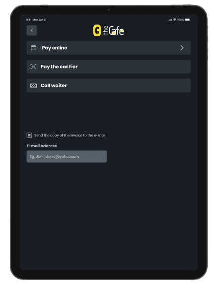
There are three options for payment
Online
Cashier service
Call the waiter/waitress
Invoices can be sent by e-mail with, or without a previously created user profile
Discounts and loyalty points could be given with some kind of loyalty card with its unique number associated with the user. In this case, The Caffe encourage users to have that kind of card and make user profiles and be our loyal everyday consumers
Trade-offs:
Users can create a user account.
Users’ top priority is to have a piece of mind time while drinking their coffee or enjoying their dessert. Therefore, there shouldn’t be any barrier to using the app. Without having to create an account, users can interact with the app.
Assuming that users, especially tourists can come to The Cafe only once, there’s no strong need for creating a user profile.
Even though I wanted this whole experience to be a fully-digital app with no need for a waiter in terms of paying the bills, a scenario with the old users and those users who aren't tech-savvy was quite possible so I created one more option called Call the waiter.
User pain points:
Trying to find a suitable coffee or desert
Navigating the ordering apps could be a long and painful process
Not sure what ingredients are used
Not being able to find allergic or non-dietary products
Waiting for a long time in line to make the payment
Not seeing a waiter or waitress to wave a hand for making a payment
Not being able to scan the QR code to make an “offline” payment
Walking through Knez Mihailova user’s attention is getting caught by a huge “kiosk” display with the saying “Welcome to The Cafe where technology meets our present”. Here actually are displayed free spots/free tables which are the main goal for users to step in
Finding the perfect spot
Searching for the best coffee in the town
Want to find all the ingredients in the coffee or desert
Wanna pay immediately
Invoices want always to be sent via e-mail
Want to make a user profile
Faved coffee wanna be ordered quick with one click
Want to pay fast with stored card
Walks down the street
Seeing big display
Steps in the shop
Finds free table
Scanning really fast the whole app
Finds the categories
Filtering by price/availability/reviews
Looking for the calories
Ordering the coffee/desert
Question about payment
Question if there are any loyalty points or discounts
Choosing payment with Google Pay/Apple Pay or maybe NFC pay
Choosing offline payment (cashier method) *
Choosing call the waiter method *
Choosing invoice to be sent to user’s e-mail address
Clicks okay, returning to the main screen
Picks the order
Enjoying peace of mind time
Continuing walking down the street
User tasks:
Search through categories (if there are any)
Filter by price/review/etc. for coffee/deserts/beverages
Pick and order
Choose how to pay
Sent the invoice to the e-mail
Goal
The Cafe shop is very large, and sometimes waiters tend to miss new customers. With the help of this digital menu, the shop would give clients a new way of ordering, without having to consult with the waiter in any way.
Responsibilities
Ideating, hi-fi prototypes, empathizing with the users, visual identity of this fictional coffee shop, making a logo for it and so much more.
Product
The Cafe is a coffee shop located in the heart of Belgrade, on Knez Mihailova street. This product is actually a digital table menu and is one of the first in the country which would allow customers to place their orders when they’d sit down.
Goals & Tasks
So, when I find out what the brief is, the next step was to anticipate actual goals and
micro-tasks for the users.
I’ve immediately jumped onto high-fidelity designs, so, the Lo-fi prototype and wireframes are missed here. After all, some of the constraints when building a new app or system, are actually wireframes. Fast-moving environments need fast solutions and rapid prototyping and quick Candy-like UI is one of them.
User stories
User stories helped me to understand context, motivation, and desired outcomes.
User journey
What steps do users take when interacting with the app. Before, during, and after!
* Things should be noted here about offline payment
When users choose offline payment there will be two options
presented - Pay to cashier or Call the waiter
Pay the cashier means that the user needs to scan a QR code or just take a photo of it, then present it to the cashier and proceed with the payment.
This is a good option when users don't wanna wait for the waiter or waitress to come by and give them their bill. Quite a fast process, but, there’s always a chance to wait in line for some time.
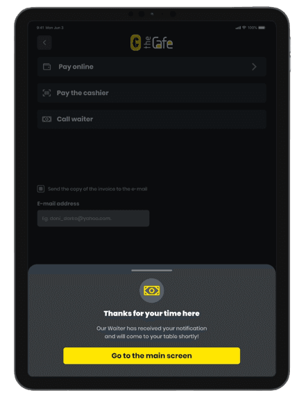
Call the waiter option is actually made for the old people, or for the users who don't have cameras on their mobile phones. Once the order is done, on the main screen of the device would be visible some kind of sticky message about the payment that needs to be done, and there will be an additional Call the waiter button, which it’s not gonna be presented if a user chose other two options.
When the cashier or waiter clicks OK on their devices, that means that the bill is sorted out and the invoice will be sent to the user’s e-mail, of course, if that option is ticked in.
In this section, I’ve deep-dived into understanding the users by forming and articulating user journeys, user flow, and understanding their priorities and pain points.
Personas would be a good addition here, but, since I’ve put all my assumptions about priorities and pain points, I realized that Personas wouldn’t be in so much great favor here.
Information architecture
After everything is kinda sorted out, the next step is to create information architecture.
Organizing and labeling the content to be easily understood by users, and ensuring its usability, findability, flexibility, and consistency.
User flow
The last piece of the puzzle. User flow is the precursor to the next and final stage of this
task -creating a user interface for this app.
This section is all about assumptions, constraints, and eventual trade-offs that were made.
Categories
Special offers
Shopping cart
Payment options
Broker
Broker
Main screen
Browse menu
Product 1
Product 2
Details
Details
Add to cart
Add to cart
Product 1
Product 2
Details
Details
Add to cart
Add to cart
Product 1
Product 2
Details
Details
Add to cart
Add to cart
Product 1
Product 2
Details
Details
Add to cart
Add to cart
Product 1
Product 2
Details
Details
Add to cart
Add to cart
Product 1
Still waiting
Preparing
Coming to you
Beverages
Desserts
Filters
Coffees
Order status
Pay offline
Scan the code
Apple Pay
Call the waiter
Google Pay
Pay with card
NFC-enabled device
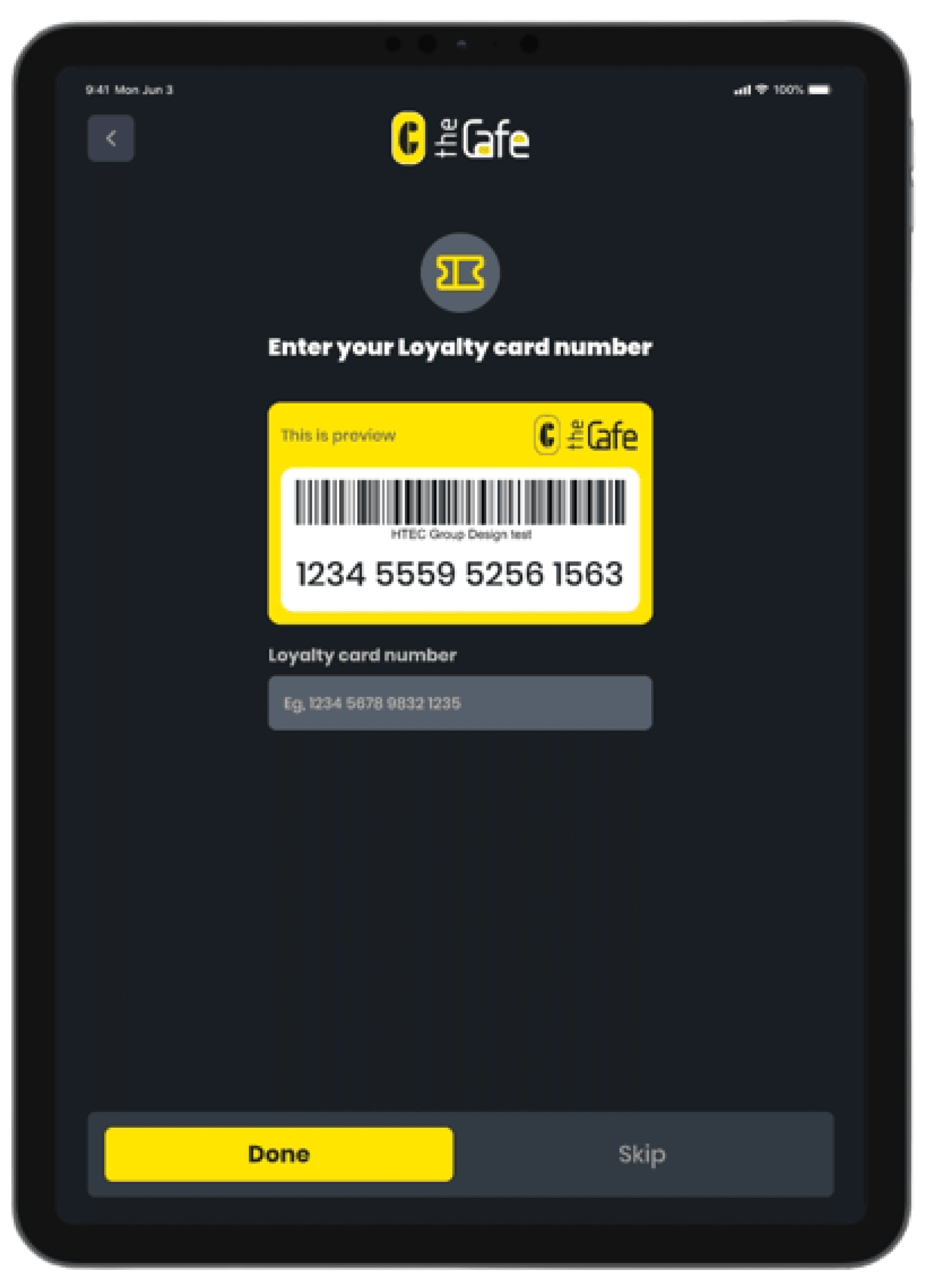
Enter loyalty card no.
Optional
Pay online
Call the waiter
Optional

The main screen
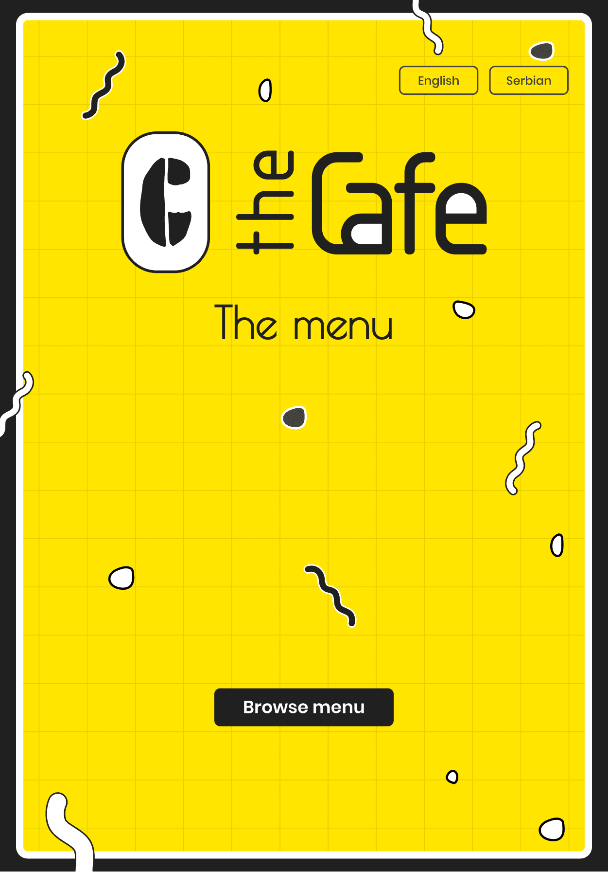
Using yellow as the main color and black as the contrast color, the main screen follows the logo style. I wanted everyone who’d sit for the first time in The Caffe to feel the same “offline” vibe when opening the printed menu.
Also, I’ve chosen the portrait mode of the tablet, just because (once again) everyone to feel more natural when will “flipping pages” of this digital and modern menu.
The Logo
I’ve made a quicky-simple, and yet (in my opinion) a quite remarkable logo for this coffee shop. I’ve opted for the main color to be yellow, because of its joyful characteristics.
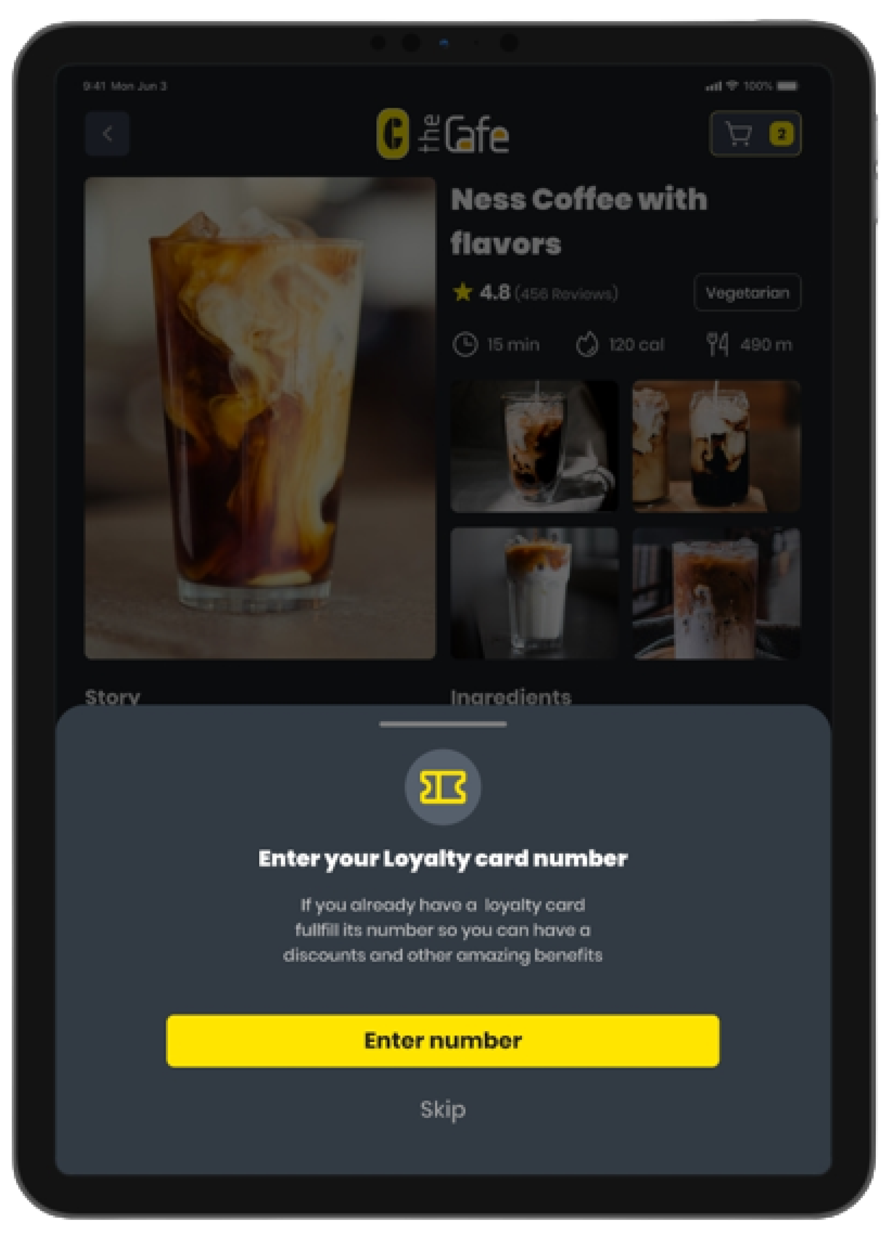
Detailed product description
On this screen, users can learn everything about the product. From reviews from the customers, the type of the product (vegetarian, vegan, etc.) to the real story about that product.
Ingredients easily could be added and removed, and a really nice addition is the info about the dietary or allergic products.
The next step from here is Add to cart, where users can pay for the product, or can continue to browse for more desserts, beverages, and coffee, so they can order later on.
Check out
This screen is known to everyone I guess, as we living in the “Ordering” society.
Info about the estimated time of the arrival of the all products is something we don’t see much on ordering pages, so it’s a big plus for customers who are enjoying The Caffe for the first time.
Loyalty card feature is presented there as well, whether there are points for some product or discount.
Home screen
When the user clicks on the Browse menu, immediately is opened the home page. Here users can find all the products, as well as current special offers.
Categories are placed on the left side of the screen, simply because this menu doesn’t mean to be one-more-mobile-product-Dribbble-app.
Loyalty card
Before we jump into the Check out and Order options, there’s one thing the user needs to answer - if he/she has a loyalty card or not.
If the answer is yes, then users need to fulfill the info, and after that checkout is ready for them with all the discounts which are given as the loyalty card owner.
Products
The price of the products is mandatory for these kinds of apps, so users can see
that info first.
Reviews from other users are presented as stars, and the estimated time for that particular product to come to your table is also presented in the Product Cards. Additionally, the number of calories (if there’s info for it) could be presented there.


Payment options
So, the final step of the user journey is, of course, payment.
Scanning the code, or calling the waiter - offline methods or online methods via Google Pay, Apple Pay, or Card are options that are opted for the users.

Problem
At location nearby, shiny new Starbacks is opened, and is getting all the attention and potential customers. The Cafe owner wants to separate himself from the masses and attempt to modernize his services, with the help of technology.

Previous case study
Verve
Next case study
LoungeBar
2015 - 2024
updated: 20241012

Dejan Zafirovski
UI/UX Designer and Illustrator
